Building ECGitHub — A Chrome Extension That Turns Contributions into an ECG
I built a heartbeat timeline for my blog in February — an ECG waveform that visualizes recent posts. Yesterday, while having tea with Robin, I showed him my blog. He pointed at the heartbeat and said, “Have you thought about turning this into a GitHub extension?” He pulled up Isometric Contributions, a Chrome extension that transforms GitHub’s contribution graph into 3D isometric blocks. Same idea, different visualization — what if we replaced the grass grid with a heartbeat?
The next morning, I fired up the harness skill and typed one command:
/harness https://byminseok.com/2026-02-22/building-a-heartbeat-timeline-for-the-blog-home — turn this into a GitHub contribution graph extension.
The harness skill was shared by Robin (Hwang Minho). (LinkedIn post)
What follows is how the Claude Code agent team built it, and the bugs I caught during hands-on testing.
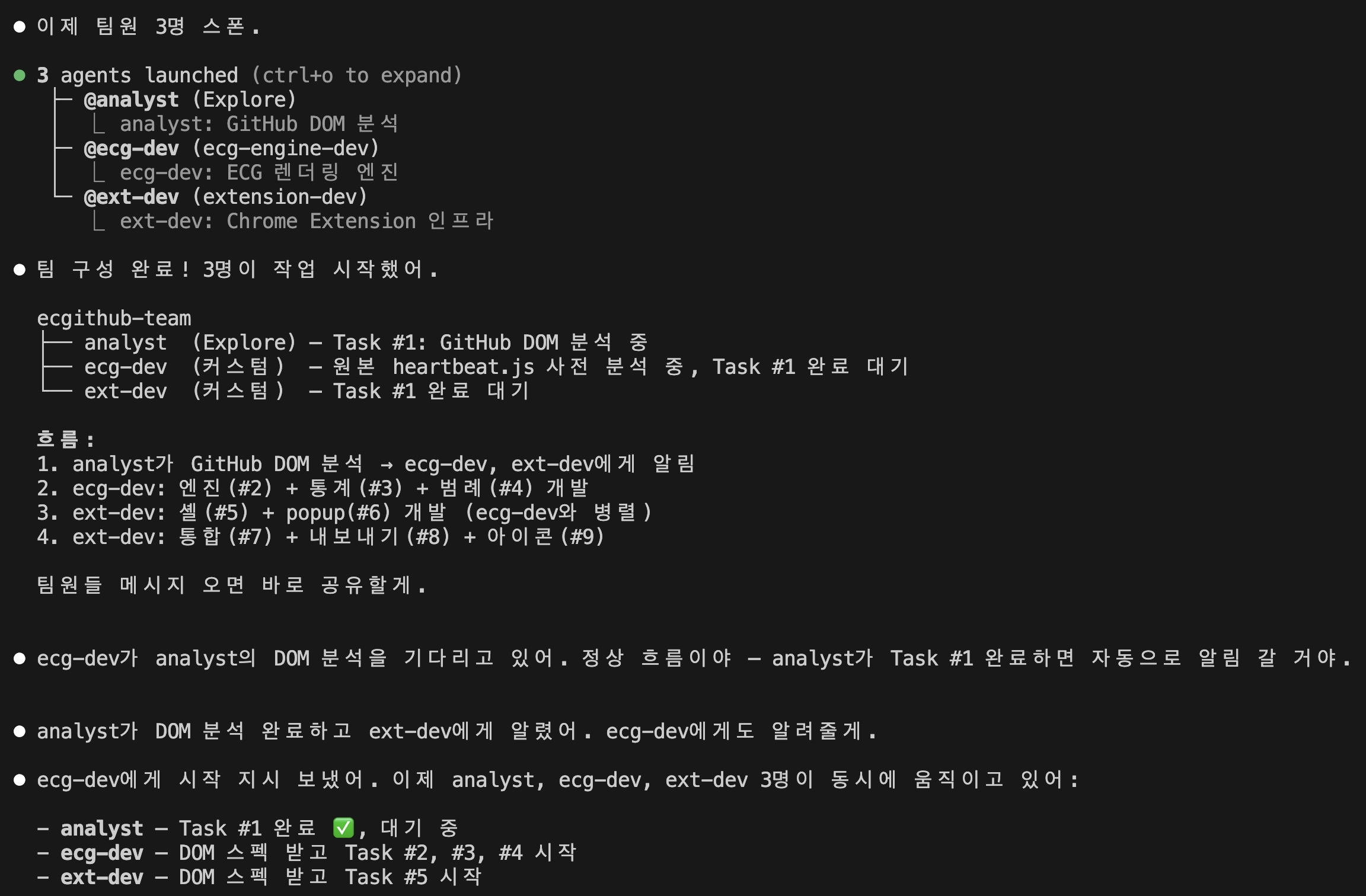
1. Harness Design — Building with an Agent Team
This project was built using Claude Code’s agent team feature. Instead of coding sequentially, three specialized agents worked in parallel.
[Leader] → TeamCreate
    │
    ├─ analyst (Explore) — GitHub DOM analysis
    │
    ├─ ecg-dev (custom) — ECG rendering engine + stats + legend
    │
    └─ ext-dev (custom) — Extension shell + Popup + integration
A pipeline + fan-out pattern. The analyst first analyzes GitHub’s DOM structure, then ecg-dev and ext-dev work in parallel based on those findings.
Three agents built the entire extension in about 40 minutes. 14 files. Of course, that was just the beginning.
2. Adapting heartbeat.js — From 10 Days to 365
The original heartbeat.js visualizes the last 10 days of posts. viewBox 700×80, 70px per day. GitHub covers 52 weeks (365 days). Simply rescaling would pack peaks so tight they’d be unreadable.
This was the same problem I faced with the blog — back then I solved it by shrinking the range from 14 to 10 days. “If most days are empty, it looks flat” — finding the right density was the key.
With GitHub, you can’t reduce the display range — you need the full year. So I approached it from the opposite direction. Instead of fewer days, scale peaks to fit the available space.
Weekly compression: group 365 days into 52 weeks, use each week’s maximum contribution level for peak height. Level 0 = flat baseline, level 4 = maximum peak.
var LEVEL_PEAK_FACTORS = [0, 0.25, 0.5, 0.75, 1.0];
var peakY = baseline - peakRange * LEVEL_PEAK_FACTORS[maxLevel];
Peak width was another issue. In the original heartbeat.js, each QRS+T waveform is 24px wide (fixed, from cx-8 to cx+16). The blog had 70px/day — plenty of room. But in weekly mode, each week is about 14px — peaks bleed into neighbors.
I added a scale parameter to ecgPeak, dynamically compressing the Bezier curve x-coordinates to fit the unit width.
var DEFAULT_PEAK_WIDTH = 24; // original peak width

function ecgPeak(cx, peakY, baseline, scale) {
  var s = scale || 1.0;
  // Q dip — scale only x-coordinates, keep y unchanged
  var d = ' C ' + (cx - 8 * s) + ',' + b + ' ' + ...
}

function calcPeakScale(unitW) {
  var ideal = (unitW * 0.8) / DEFAULT_PEAK_WIDTH;
  return Math.max(0.05, Math.min(1.2, ideal));
}
In weekly mode, scale is 0.46 — peaks shrink to 11px, occupying 80% of the 14px slot. Preserves the QRS+T shape without overlap.
3. Fighting GitHub’s DOM
First build loaded, nothing changed. The DOM selectors were wrong.
The agents used svg.js-calendar-graph-svg and rect[data-date], but current GitHub uses an HTML table, not SVG.
<!-- What our code was looking for (deprecated) -->
<svg class="js-calendar-graph-svg">
  <rect data-date="2026-02-22" data-level="4" />
</svg>

<!-- Actual GitHub DOM (2026) -->
<table class="ContributionCalendar-grid js-calendar-graph-table">
  <td class="ContributionCalendar-day" data-date="2026-02-22" data-level="4">
  </td>
</table>
Fixed the selector to td.ContributionCalendar-day[data-date]. Contribution counts are extracted from tool-tip custom element text via regex.
4. Bug Hunting — CSS Priority, Toggle, Themes
First render worked, but bugs poured out. Fixing them one by one.
Color theme not changing
Selecting Blue or Purple in the popup kept the ECG line green. Root cause: CSS specificity.
createEcgSvg set color via path.setAttribute('stroke', lineColor) — an SVG attribute. But CSS had .ecg-line { stroke: var(--ecg-line-color, #39d353) } — CSS properties override SVG attributes. And --ecg-line-color was never set anywhere.
Fix: set the CSS variable directly on the ECG container.
container.style.setProperty('--ecg-line-color', lineColor);
One line. ECG line, peak dots, stats panel values, legend — everything follows the theme color through CSS variable cascade.
Toggle stuck on “Both” mode
Selecting ECG mode kept showing the original grass grid. We were hiding .js-calendar-graph, but that only wraps the contribution table. The <h2> (contribution count text) and year tabs are siblings outside this element.
Fix: hide .js-yearly-contributions (the entire contribution section) instead. Place the ECG container outside this section so it stays visible when the section is hidden.
Stats text invisible in light mode
Streaks text was white on white. Light mode CSS overrides were on .ecg-stats-block but not on the parent .ecg-stats-panel that actually inherits color. CSS variable scope issue.
5. Year Switching — The Observer That Dies and Resurrects
Clicking 2026, 2025, 2024 on a GitHub profile switches contribution data. Initially, the ECG didn’t react at all.
The MutationObserver was attached to .js-calendar-graph, but GitHub replaces the element entirely when switching years. The observer dies with the removed element.
Tried attaching to the parent .js-yearly-contributions — same problem, GitHub can replace the entire section.
Solution: a single persistent observer on document.body, tracking the .js-calendar-graph element’s identity.
let knownGraphEl = null;

domObserver = new MutationObserver(() => {
  const currentGraph = getGraph();

  if (currentGraph && !knownGraphEl) {
    // Graph just appeared (lazy load)
    scheduleRender();
  }

  if (currentGraph !== knownGraphEl) {
    // Element was replaced (year switch)
    if (currentMode === 'ecg') {
      // Immediately hide — prevent grass flash
      getContributionSection()?.classList.add('ecgithub-hidden');
    }
    scheduleRender();
  }
});
The key insight: element reference comparison (currentGraph !== knownGraphEl). Not checking if DOM content changed, but whether the element itself is a new object. Catches any replacement method — innerHTML, replaceChild, turbo navigation.
The year-switch flash was another issue: the new section doesn’t have ecgithub-hidden, so it shows during the 300ms debounce. Fixed by adding the class immediately in the observer callback.
6. A Living Heartbeat — Pulse Dot
After all this, something felt missing. An ECG monitor shows whether the heart is beating right now. It’s not a static graph.
I added a pulsing dot at the last active peak position. Not at the end of the line (December), but at the last week with actual contributions.
var lastPeak = peaks[peaks.length - 1];
var endpoint = lastPeak
  ? { x: lastPeak.cx, y: lastPeak.cy, alive: true }
  : { x: W, y: baseline, alive: false };
This means:
- “in last year” view → pulse at the latest peak — “still beating”
- 2026 view → pulse near March, flatline after — “alive until here”
- 2024 view → pulse at the last activity — “that year’s final heartbeat”
The dot fades in after the line-drawing animation completes. Like a pen mark left behind by the monitor sweep.
@keyframes ecg-pulse {
  0%, 100% { opacity: 1; transform: scale(1); }
  50% { opacity: 0.2; transform: scale(0.4); }
}
7. Final Structure
ecgithub/
├── manifest.json              # Manifest V3
├── src/
│   ├── ecg-engine.js          # ECG rendering (adaptive scaling, pulse dot)
│   ├── ecg-stats.js           # Stats (Total, Best Day, Streaks)
│   ├── ecg-legend.js          # Legend (ECG mini waveforms)
│   ├── ecg-export.js          # PNG export
│   ├── ecg-styles.css         # Styles (light/dark, reduced-motion)
│   ├── content.js             # Content Script (observer, view toggle)
│   ├── popup.html/js/css      # Settings UI (on/off, themes, stats toggle)
├── icons/                     # Icons
├── store/                     # Chrome Web Store assets
├── LICENSE                    # MIT
└── README.md
On the Build Process
This extension wasn’t typed line by line. It was built by designing a harness, coordinating an agent team, validating output, and hunting bugs.
The agents produced the first build in 40 minutes. But the real work came after. CSS specificity bugs, DOM element replacement detection, peak scaling — I could have spun up a QA agent, but this time I chose to diagnose problems myself, explain exactly why things broke, and point toward solutions.
As a technical planner, I can read code and understand structure. Writing Bezier curve coordinates from scratch isn’t my domain. But noticing that “a 24px peak designed for 70px/day overflows at 14px/week” and connecting it to my blog experience to suggest a solution — that’s a different kind of engineering than typing code.
GitHub: github.com/theorakim/ecgithub Chrome Web Store: Coming soon