Building a Heartbeat Timeline for the Blog Home
This blog uses a two-column spread layout on desktops ⟨960px and wider⟩. The left column displays the list, while the right column shows the main content. The home screen follows the same pattern, with intro text on the left and a list of recent posts on the right. The problem was mobile. Since spread__right was set to display: none, the recent posts list wasn't visible at all. Even on the home page, only the intro text appeared.
I needed a way to access recent content on mobile too. But just tacking the post list below felt boring, so I thought adding something visually interesting would be nice.
1. Idea — ECG from GitHub's Contribution Graph
My first thought was a grid-based counter like GitHub's contribution graph. Something that expressed posting frequency over recent days with color intensity. But this didn't match the blog's tone. It felt too much like a data dashboard.
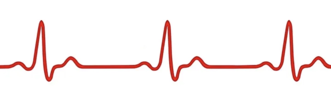
Then I saw an ECG image and wondered: what if I used this as a timeline? Days with posts would show peaks like a beating heart, while days without would show a flat baseline. I thought this could convey the feeling that the blog is alive.
There were two directions:
- A. Decorative ECG + post list below: The ECG is just a pretty picture; the actual functionality comes from the list below
- B. Data-driven ECG: Each peak represents an actual post, and clicking takes you to that post
I chose B. Since I was building it, I wanted to make it interactive.
2. Design
The core structure is as follows:
- Draw the ECG line with a single path inside an SVG
viewBox="0 0 700 80" - Baseline at
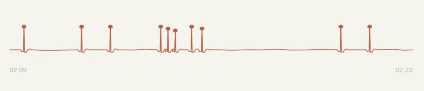
y=62, peak tops neary=14 - Each date occupies a 70px width (700 ÷ 10 days)
- Days without posts show subtle noise rippling from the baseline
- Days with posts feature peaks rising as ECG QRS+T waveforms
- A 44px HTML overlay link is placed absolutely above the peak to ensure a touchable area
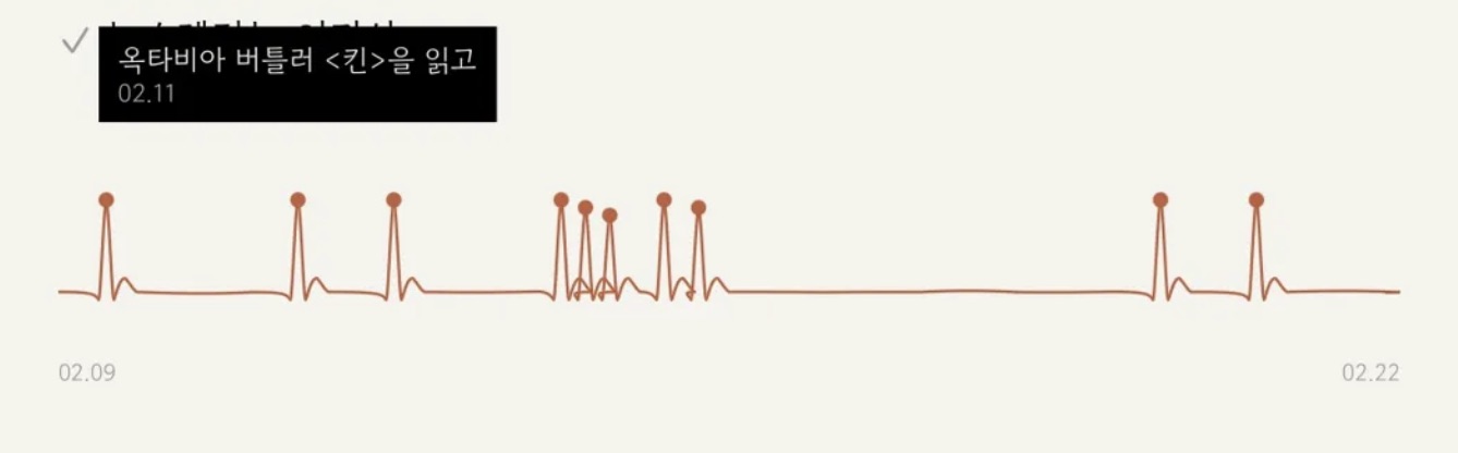
- Hover displays post title + date tooltip; click navigates to the post
Created Heartbeat.init() using the same IIFE module pattern as the existing Spread.js. Jekyll Liquid generates the last 10 days' post data as JSON, which is passed to JS to dynamically draw the SVG.
3. ECG Waveform — From Straight Line to Curve
Initially, peaks were drawn using the SVG L⟨line-to⟩ command. The result… wasn't an ECG, but a sawtooth pattern. Vertical spikes bouncing up and down.
The actual ECG QRS waveform sequence is:
- Q Deep — Slightly descends below the baseline
- R peak — Steep ascent (highest point)
- S notch — Steep descent back down
- T wave — Gradual return to baseline with a gentle slope
I implemented this using the SVG cubic Bézier curve⟨C command⟩.
function ecgPeak(cx, peakY) {
  var b = BASELINE;
  // Q dip: 기저선에서 살짝 아래로
  return ' C ' + (cx-8) + ',' + b + ' ' + (cx-6) + ',' + (b+1) + ' ' + (cx-4) + ',' + (b+4) +
  // R peak: 가파른 상승
         ' C ' + (cx-3) + ',' + (b+5) + ' ' + (cx-1.5) + ',' + (peakY+5) + ' ' + cx + ',' + peakY +
  // S dip: 가파른 하강
         ' C ' + (cx+1.5) + ',' + (peakY+5) + ' ' + (cx+3) + ',' + (b+5) + ' ' + (cx+4) + ',' + (b+4) +
  // T wave: 완만한 언덕
         ' C ' + (cx+5) + ',' + (b+2) + ' ' + (cx+7) + ',' + (b-8) + ' ' + (cx+10) + ',' + (b-7) +
  // baseline 복귀
         ' C ' + (cx+12) + ',' + (b-5) + ' ' + (cx+14) + ',' + (b-1) + ' ' + (cx+16) + ',' + b;
}
The baseline on empty days was also changed from L⟨straight line⟩ to Q⟨quadratic Bézier⟩ to add subtle ripples. Using seeded random ensures the same noise pattern appears each time, so the shape doesn't change even when refreshing the page.
4. Period Tuning — From 14 Days to 10 Days
Initially set to the last two weeks (14 days), but since posts clustered on specific days, most days appeared empty, making the timeline look flat like a dead electrocardiogram. Shortening it to one week proved too brief, potentially missing posts entirely.
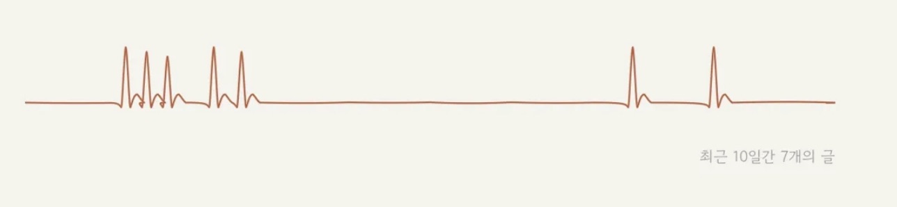
Ultimately, 10 days proved optimal. It maintained sufficient density while the flat baseline on empty days made the peaks on days with posts stand out more. The bottom label "N posts from the last 10 days" provides context.
5. Touch Interaction Design
On desktop, hover displays a tooltip, and clicking navigates to the archive spread layout⟨?read= query parameter⟩. Mobile lacks hover, so a different approach was needed.
We applied a 2-tap pattern:
- First tap → Tooltip appears with post title preview (automatically closes after 3 seconds)
- Second tap → Actually navigates to that post
This pattern was borrowed from iOS's link preview behavior. It prevents accidentally opening the wrong post while allowing immediate navigation with a second tap.
6. Tooltip Edge Adjustment
Since the ECG timeline stretches horizontally, the tooltips for peaks at the far ends might extend off-screen. After calculating each tooltip's position in JS, if it goes beyond the container, we shift it left or right using the CSS variable --tooltip-offset.
function adjustTooltips(links, container) {
  var cw = container.offsetWidth;
  for (var i = 0; i < links.length; i++) {
    var left = parseFloat(links[i].el.style.left);
    var halfTip = 90; // max-width 180px의 절반
    var offset = '-50%';
    if (left - halfTip < 0) {
      offset = 'calc(-50% + ' + (halfTip - left) + 'px)';
    } else if (left + halfTip > cw) {
      offset = 'calc(-50% - ' + (left + halfTip - cw) + 'px)';
    }
    links[i].el.style.setProperty('--tooltip-offset', offset);
  }
}
Tooltips are positioned below the peaks. Placing them above would obscure the ECG line.
7. Animation
Upon page load, after the intro typing effect⟨existing⟩, the ECG line is drawn from left to right. This uses the stroke-dasharray/stroke-dashoffset trick:
var length = path.getTotalLength();
path.style.strokeDasharray = length;
path.style.strokeDashoffset = length;
// 0.9초 후 시작, 1.2초에 걸쳐 그려짐
path.style.transition = 'stroke-dashoffset 1.2s ease-in-out';
path.style.strokeDashoffset = '0';
After the line drawing completes, HTML overlay links fade in sequentially 0.5 seconds later⟨0.12-second intervals⟩. If prefers-reduced-motion: reduce is set, they display immediately without animation.
8. Removed the circles
Initially<circle></circle> on each peak
This posed a dilemma. Removing the circles would eliminate the visual cue indicating "clickable areas" on mobile. However, in reality, a 44px HTML overlay <div<a>> tag floats absolutely over the SVG. Thus, the touch area remains unchanged regardless of whether the circles are visible. Hovering or tapping triggers a tooltip, making the interactivity naturally discoverable.
Ultimately, I removed the SVG circle. Leaving only the line significantly enhanced the minimalist feel inherent to the ECG.
9. FOUC That Happened Immediately After Deployment
After pushing the finished code to GitHub Pages and visiting the homepage, the ECG appeared completely black, with the post titles listed as plain text below. Refreshing fixed it, but this only happened on the initial load.
It was a FOUC⟨Flash of Unstyled Content⟩ issue. As the browser parsed the HTML, the `</a></circle>